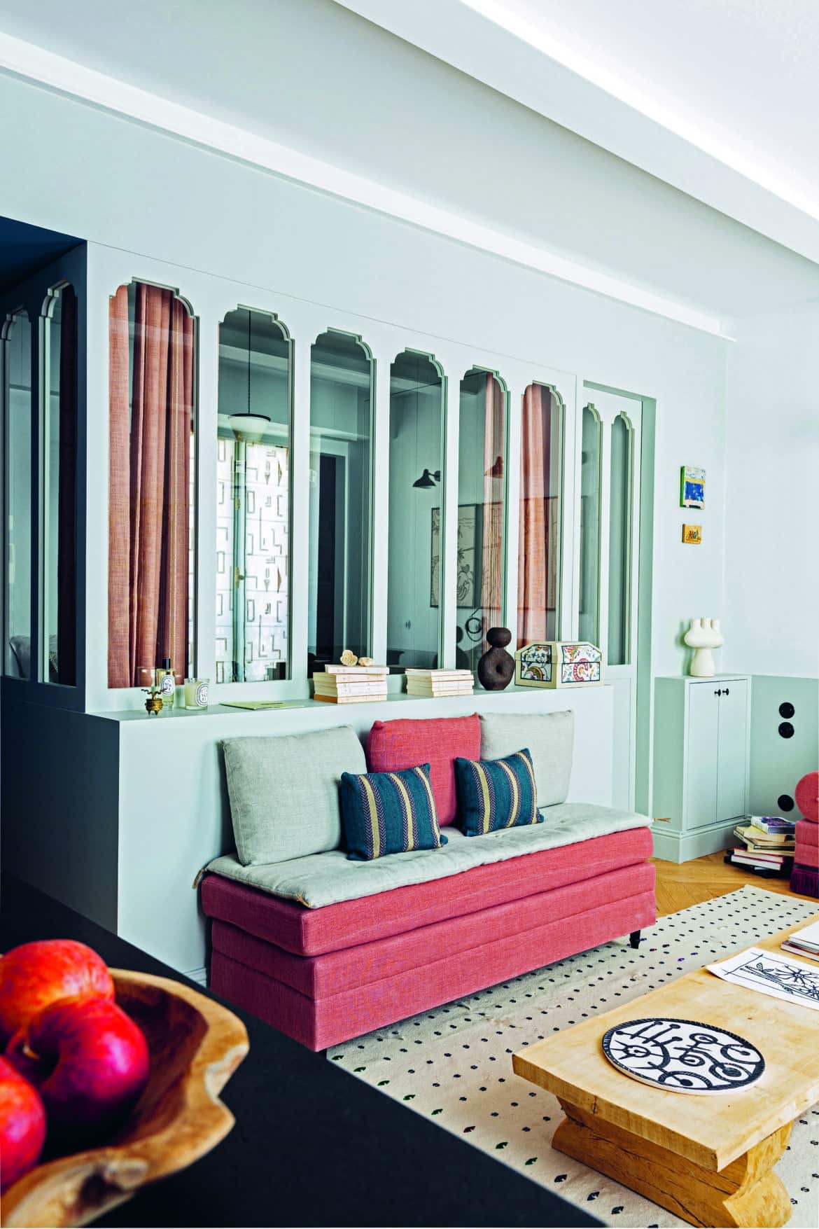
When it comes to transforming the notoriously tiny apartments of Paris into havens of style and functionality, there’s one name that stands out among the crowd: Marianne Evennou. Renowned for her expertise in Parisian interior design, Marianne has captured a wide audience of followers with her imaginative approach to small-scale living.
One attention-grabbing aspect of Marianne’s design that sets her apart from other interior designers is her fantastic use of color. While the traditional Parisian style favors clean, white walls, Marianne’s apartments play with the unexpected. Carefully choosing each paint color for every project, Marianne can evoke the faded grandeur of a provincial dining room in a Marais home, or turns the darkest room into the most welcoming of abodes.
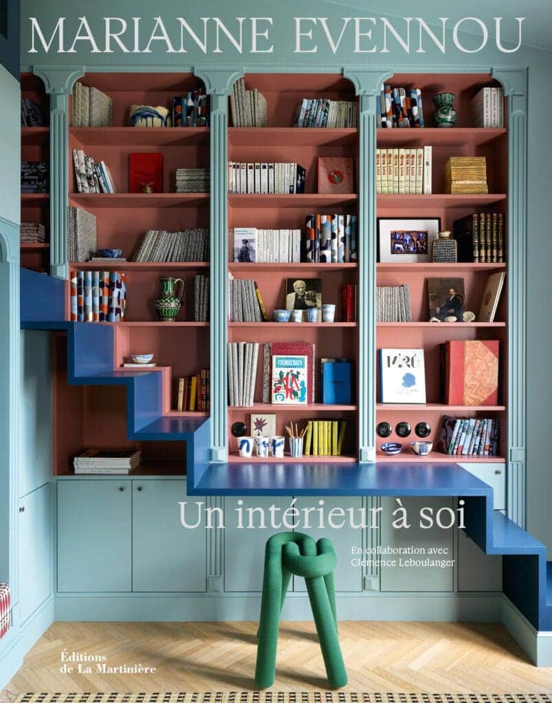
So, if you’re feeling inspired, come with us as we delve into some advice from Evennou’s new book Un Intérieur à Soi (A Home of Your Own) detailing her design philosophy on how you can unlock the full potential of your living spaces through the thoughtful application of color!
Finding your colors
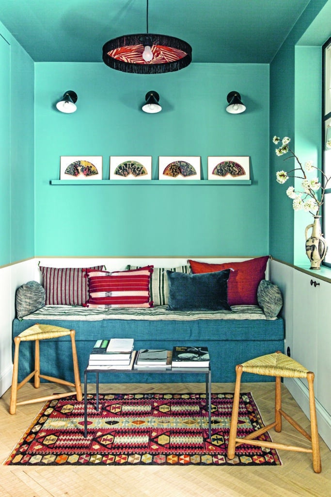
The first principle that guide’s Marianne’s design choices is her belief that “Nothing is more subjective than the world of colors.” “Haven’t we all experienced a shade that one person sees as green and another sees as blue, for example?” she notes. Stepping away from the objective, therefore, Marianne focuses on color’s subjectivity: how it translates into a different emotion for each of us, based on our culture, personal history, and current feelings.
“I am absolutely convinced that each person carries an innate color chart that suits their character, personality, and sensitivity. It’s like an extension of their inner self. Some people think in vibrant and joyful summer colors, while others think in autumn colors with more muted and serious nuances.”
Seeing color as a way to embellish our inner lives, the first step in learning to use color yourself and creating your own unique palette is to identify how different colors make you feel. Think about it as you might food and ask, “does this color kick-start my appetite”. Secondly, note how it is that you want to feel in your home, and then choose your preferred colors accordingly!
Create a palette
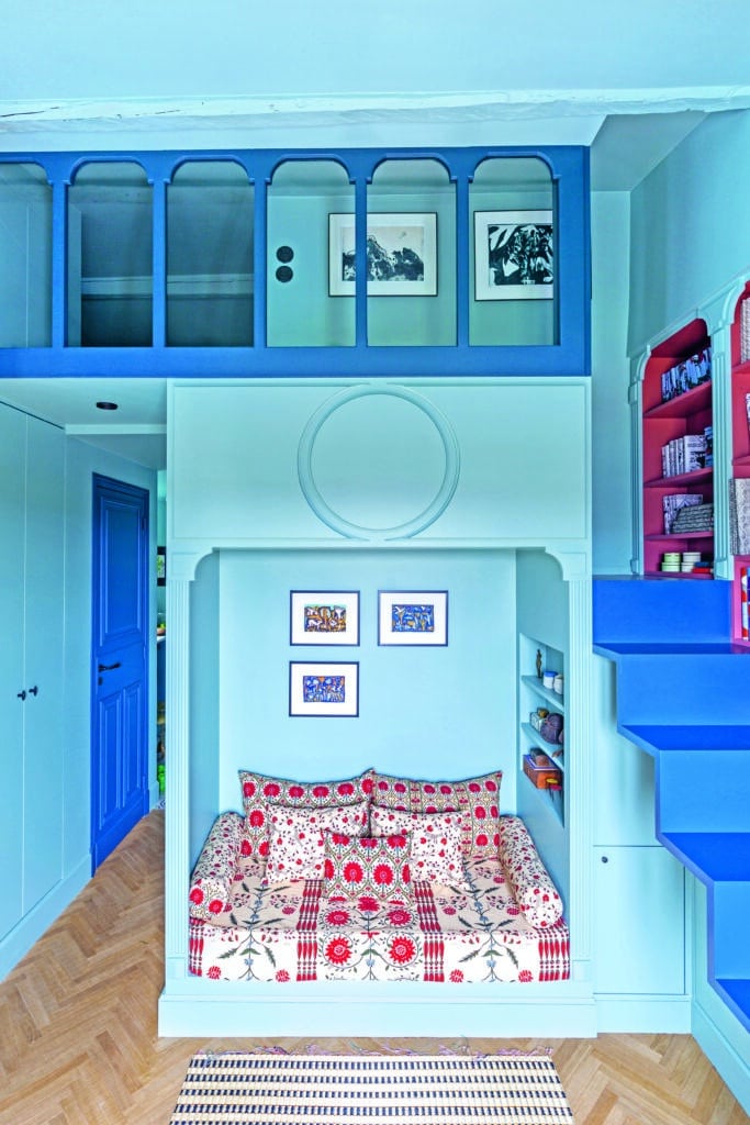
“Once we have found our range of hues, we still need to make them interact” Marianne continues. “It is not enough to place colors, no matter how beautiful they may be, next to each other; the colors must also react to one another, otherwise, you have cacophony”, she explains.
Therefore, it’s vital to consider how each color’s many moods or connections affect others around it. Just as a sunny and bright mood is opposite to moodiness, a cool and pale yellow will feel similarly at odds paired with hash blacks. To paraphrase Marianne, your colors should be singing together, not screaming at each other!
Let go of the fear
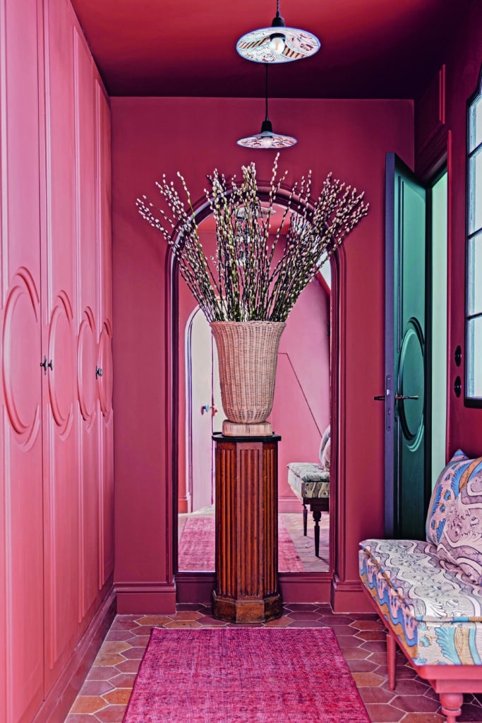
When it comes to selecting colors, people often feel intimidated and fearful of making a style blunder. However, continuing the metaphorical parallel with the sense of taste can help overcome this apprehension. By realizing that you can approach color in the same way as you’re able to discern what tastes good in one’s mouth, you’ll learn to trust your instincts and confidently define what is aesthetically pleasing to you.
As Marianne notes, “There is no right or wrong color. Just a color that pleases you, just as you know how to determine if you like a dish or not”.
Consider the bigger picture
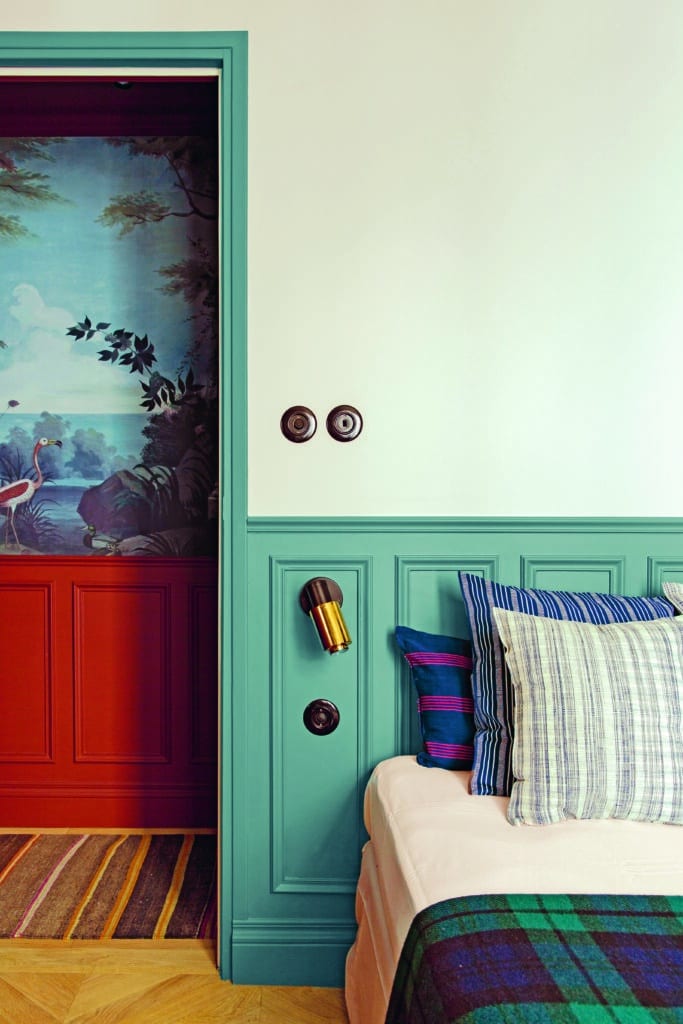
by the hallway’s watery fresco-style wallpaper
You’ll also need to consider how your colors interact from room to room to ensure that a harmonious atmosphere is created. “But” Marianne warns, “this melody must be personal, and that’s the interest of this search”.
Rather than thinking in terms of what should be done, or is typically combined, her advice is to keep the door open to all possibilities without worrying about the judgment of others.
“If you let yourself be guided by your instinct, you will see that it is not so difficult to find the shades that suit you. The only acceptable guide, in my opinion, is the emotion you feel”.
Don’t forget the details
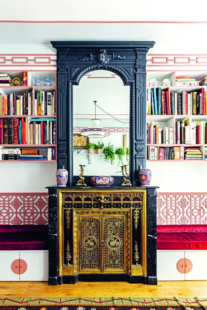
Finally, don’t forget the details, as this is where personality can really shine through!
“I have never understood why a ceiling should be white” states Marianne. Instead, why not try painting your walls and ceilings an enveloping, uniform color. Or why not try painting just your ceiling for some added height and drama.
“Very often, when I don’t have the possibility of having cornices on the ceiling and moldings on the wall, I like to play with colors to dress them up” she adds. Accentuating the differences in shades with a molding or baseboard can subtly bring together a whole space without, giving it character without the need for an extravagant budget.
So, next time you’re updating your interiors, we hope you feel a bit braver to be bold with color!
